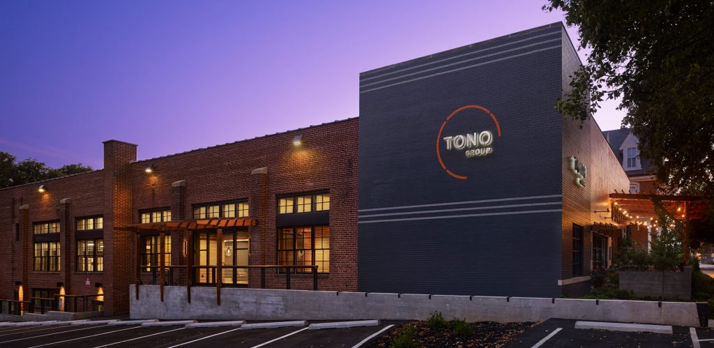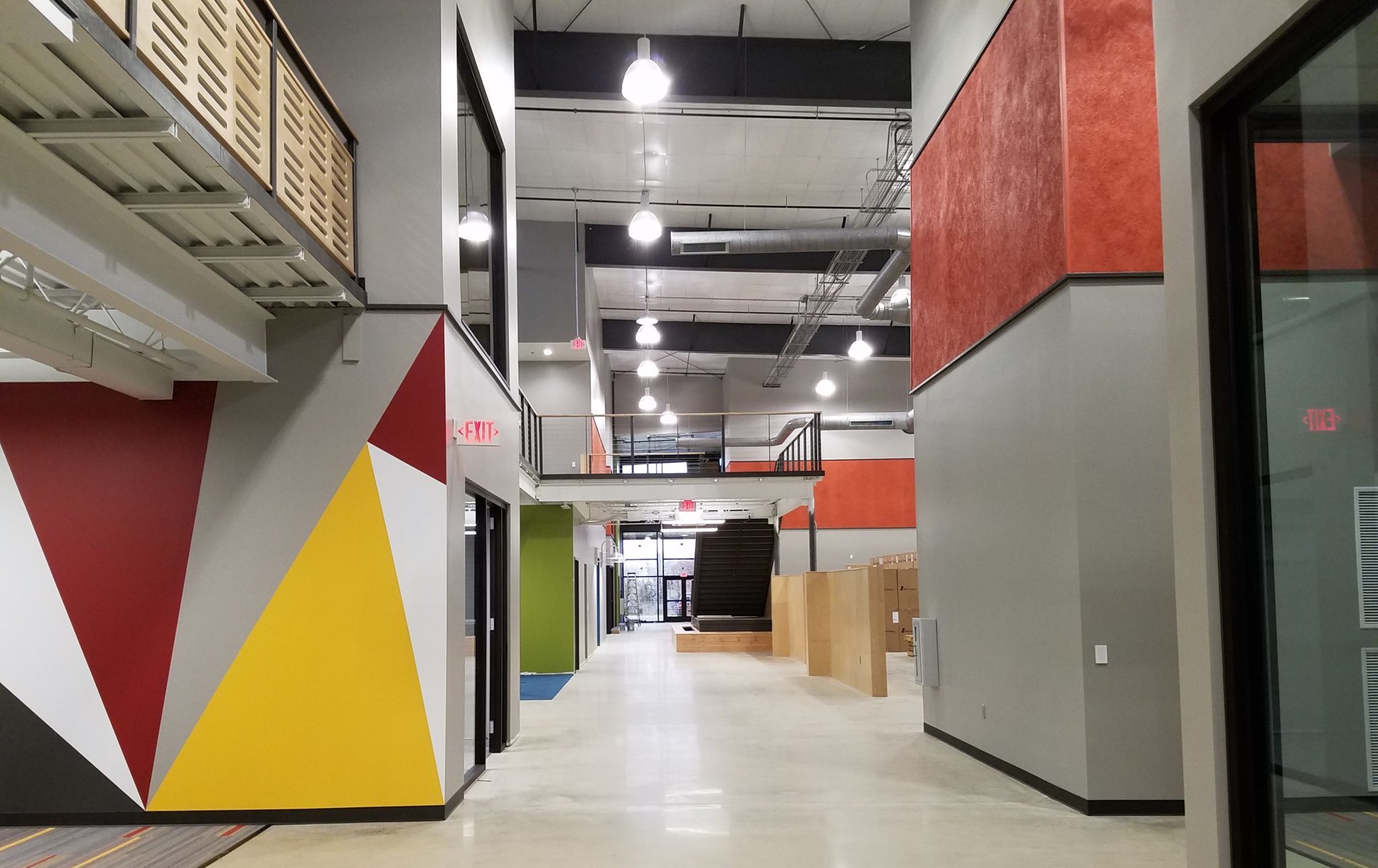
THE IMPACT OF 3D BRANDING (WITH EXAMPLES)
An increasing number of businesses are realizing the importance of extending their corporate branding past traditional channels. It’s not enough to have a sleek and user-friendly website or to run print and digital advertisements—branding needs to make its mark on physical space as well.
Several 21st century trends have made this wave of so-called “experiential design” necessary, including advancing technological capabilities, the downward spiral of traditional retail, and a millennial preference for experiences over product consumption.
Aiming to keep up with the changing times, savvy business owners are employing architects and interior designers to transform their offices, manufacturing plants, restaurants, and other facilities into 3D manifestations of their brands.
In doing so, they achieve the following objectives:
1. Tell their brand’s story
A physical building can communicate why a business exists, what it offers, and how it distinguishes itself from competition.
2. Exemplify and support internal company culture
A strong workforce is crucial to business success. Corporate offices that cater to employee needs and behaviors make for a happier work environment and can act as a recruitment tool for more talent.
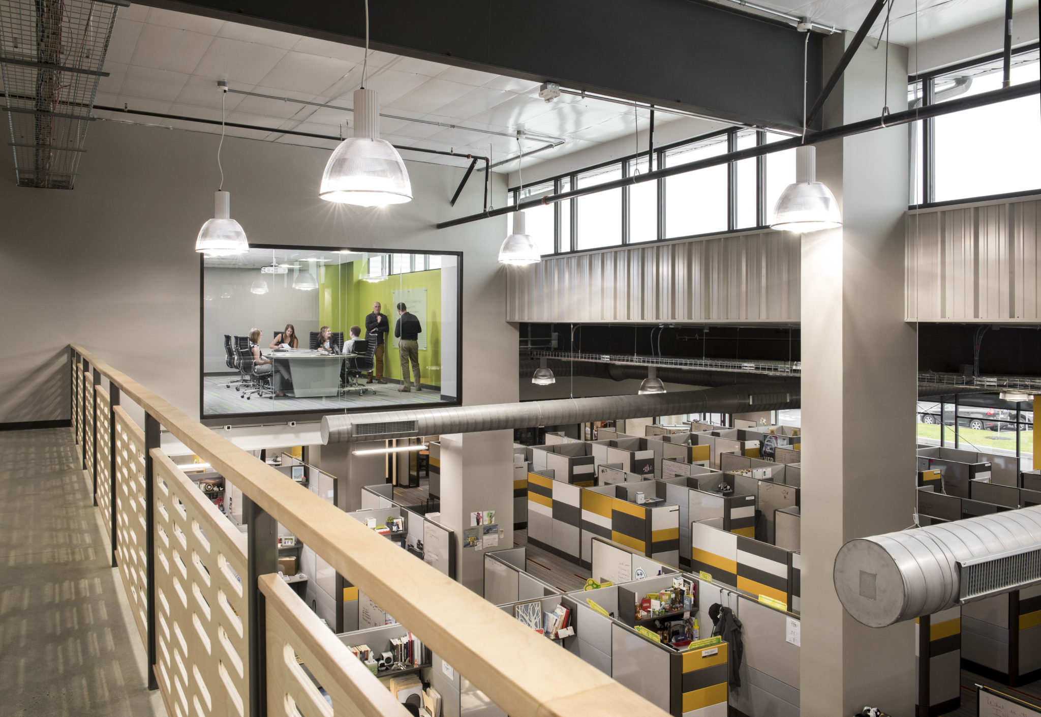
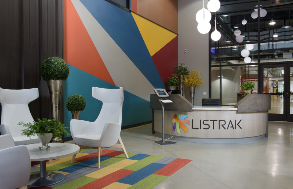
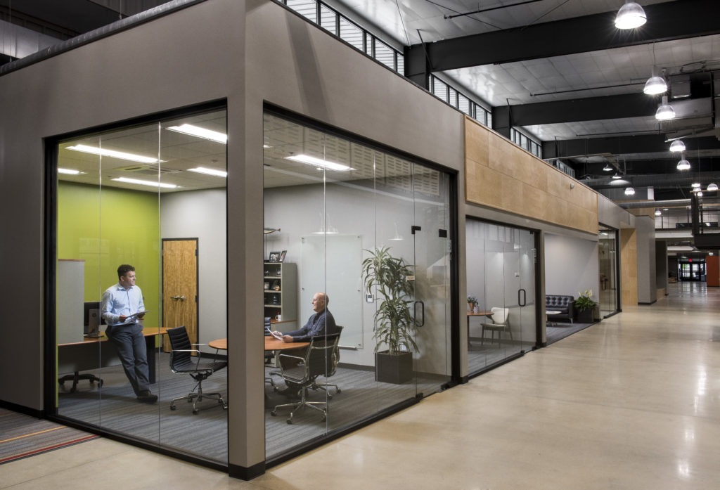
Listrak H.Q. Interior Office Space
3. Provide visitors with a comfortable and interactive experience
In our social media driven world, people value experiences they can share. By creating intriguing, people-centric environments (and even including “Instagrammable” backgrounds), businesses can stimulate conversation around their physical space, and in turn, their brands as a whole.
4. Foster an emotional connection
Creating favorable brand associations is hugely important. Whether through the use of color, art, lighting, or interactive media, businesses can ensure that user experience is both positive and memorable.
At TONO Group, we’ve helped a number of clients translate their brands into physical space. The following are a few examples from our portfolio.
LISTRAK HQ
A global marketing company, Listrak required that its new corporate headquarters exemplify its commitment to innovation while also serving a multi-talented and growing staff of software developers, salespeople, and product managers.
The final design is made up of 110,000 square feet of corporate office space, including several dozen private offices, more than 500 workstations, and 43 conference and meeting rooms.
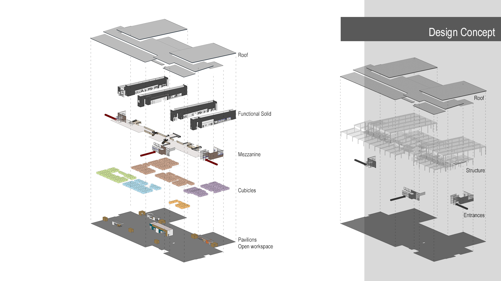
Listrak Design Concept
Taking cues from the Listrak brand colors and logo, our designers grouped the company’s departments by function, then assigned specific color schemes to each of them to assist with wayfinding. Every grouping was composed of two departments and included a main accent color and secondary accent color. As users travel throughout the expansive office space, they are able to distinguish easily between key areas.
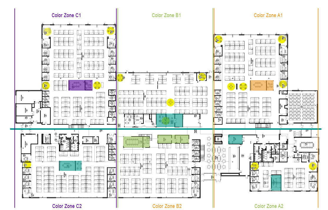
Listrak Color Concepts
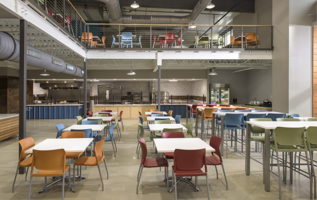
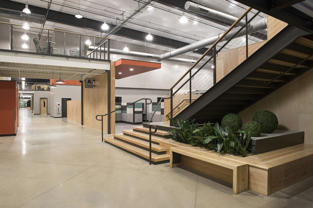
In addition to prioritizing a functional departmental layout, TONO kept Listrak’s employees top of mind. The building’s main concourse facilitates team interaction, housing open lounges, break areas, restrooms, meeting areas, and two restaurants located in the central common areas. The facility also includes a fitness center, meditation spaces, walking/running trails, and gardens. These amenities are a reflection of Listrak’s outstanding company culture, serving current employees and attracting new talent.
Listrak Completed Space
VIRTUA HEALTH
Similar to Listrak, TONO’s work for Virtua Health used color as a powerful brand messenger. The healthcare provider’s main practice types—Urgent Care, Primary Care, and Specialty Care—each adopted their own distinct color palettes.
The palette for Urgent Care is bright and bold, composed mainly of vivid greens and blues. For these facilities, Virtua aimed to reflect an atmosphere akin to a retail space—patients are served quickly and attentively, and the chosen colors reflect an upbeat pace.
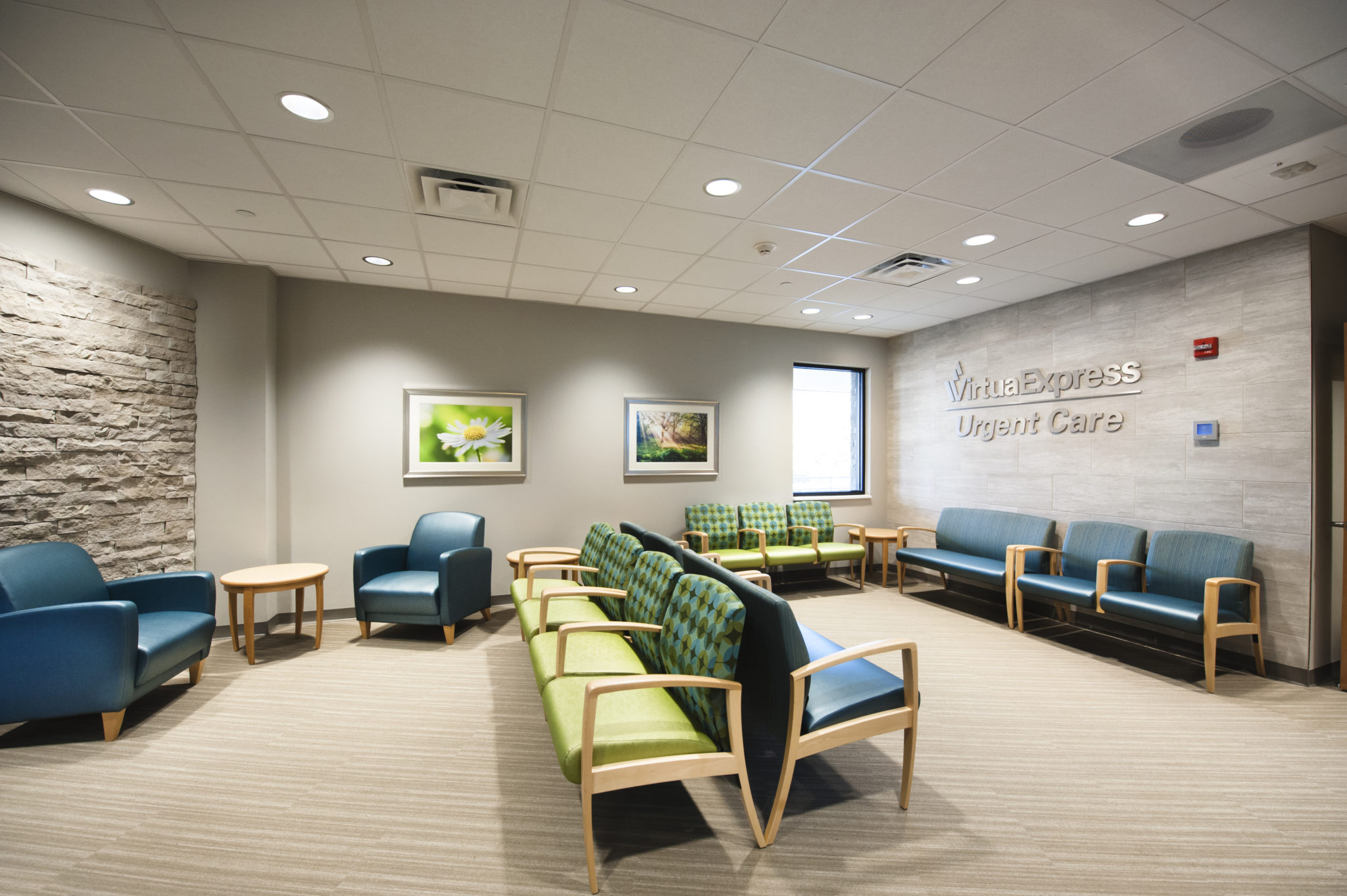
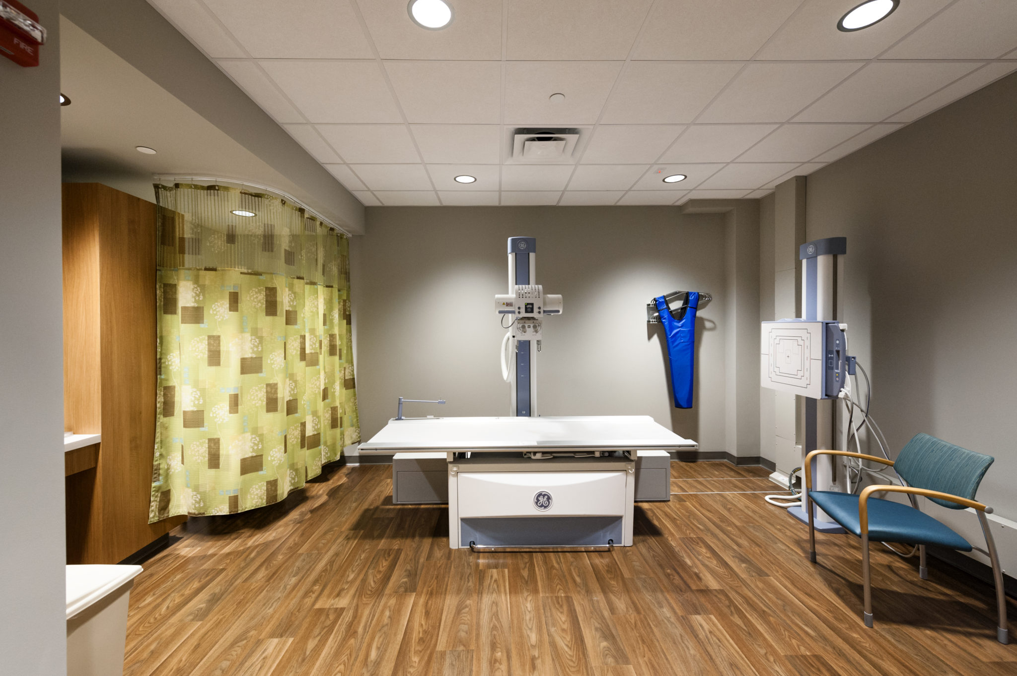
Virtua Urgent Care Color Palette, featured in spaces at Virtua Marlton and Virtua Medford.
The palette for Specialty Care, on the other hand, embraces more muted tones, including soft browns and grey-blues. These colors communicate hospitality rather than retail, prioritizing experience over mere efficiency. Soft and soothing, the chosen hues give patients a sense of calm.
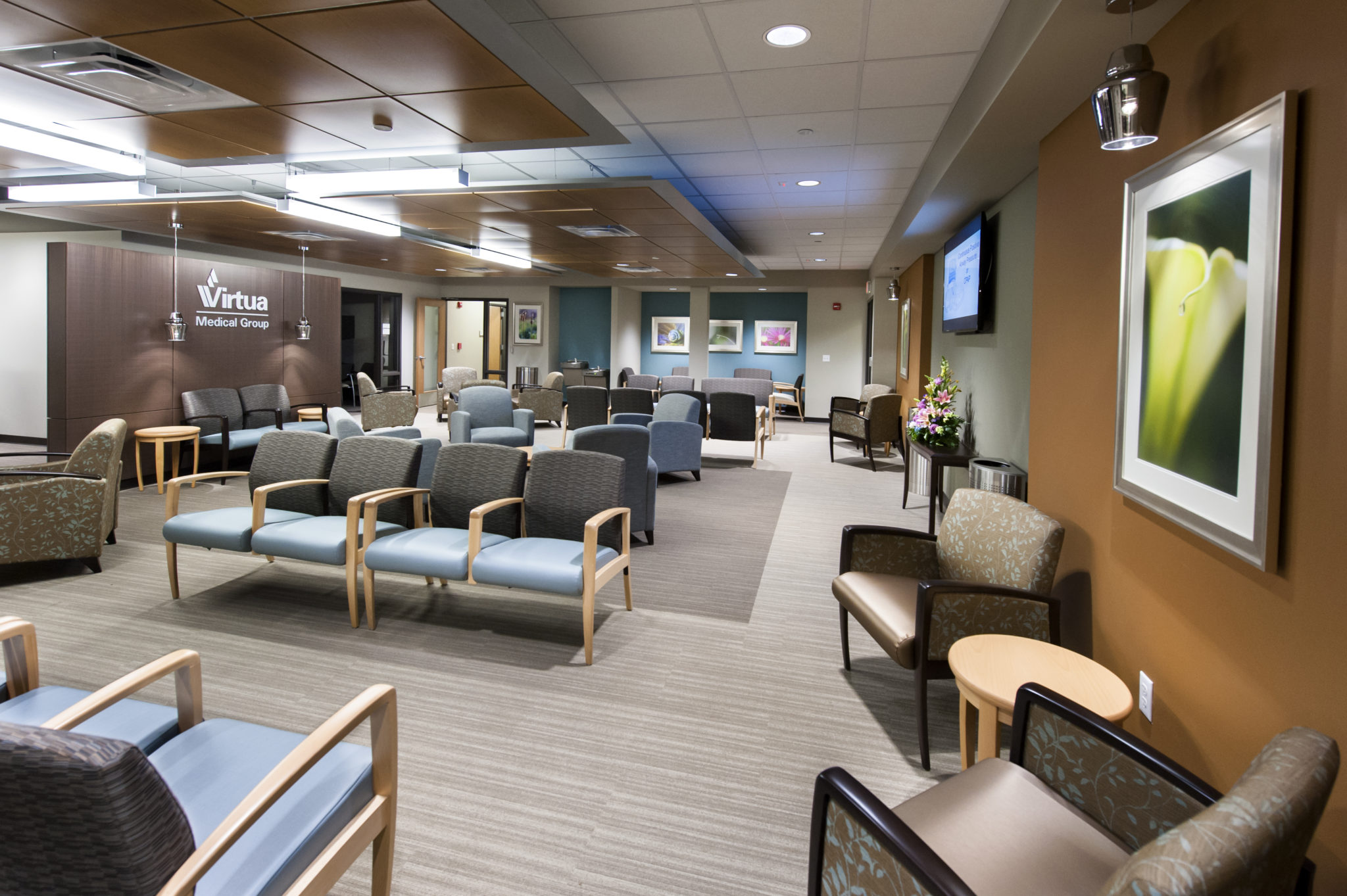
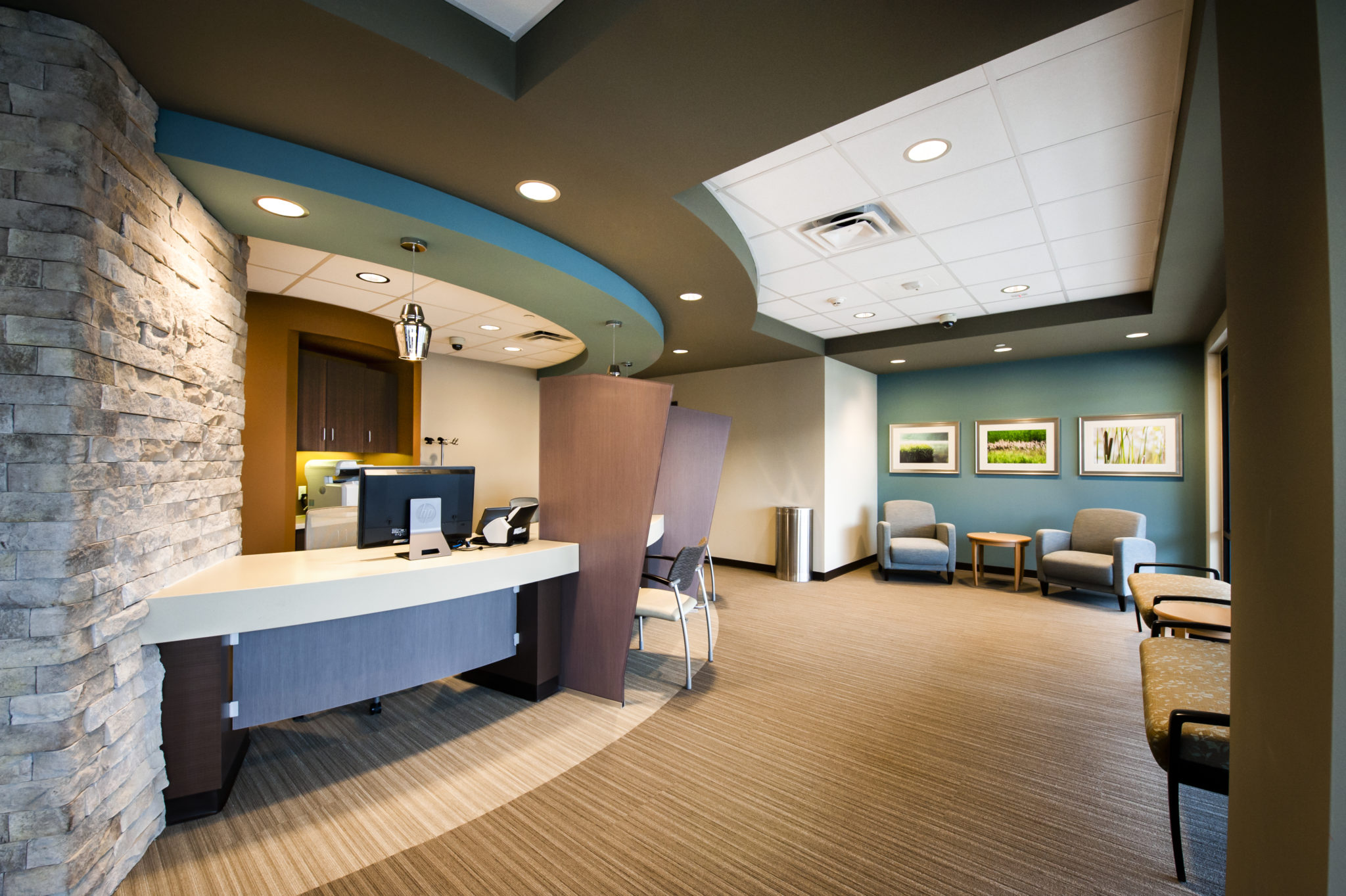
Virtua Specialty Care Color Palette, featured in spaces at Virtua Medford.
By design, Virtua’s consistent use of color and finishes means that visitors can walk into any Virtua location, clearly identify it as a Virtua space, and even discern the practice type, without the aid of any signage.
PELLETRON CORPORATION
Pelletron is a global plastics conveying company which called on TONO Architects, PROTO Construction Management, and Interiors by DECO to design and construct their interior office environment.
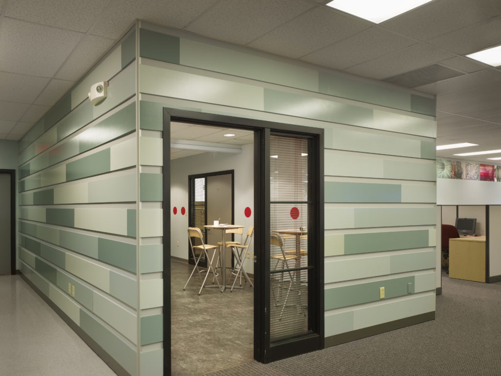
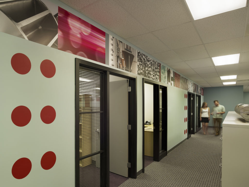
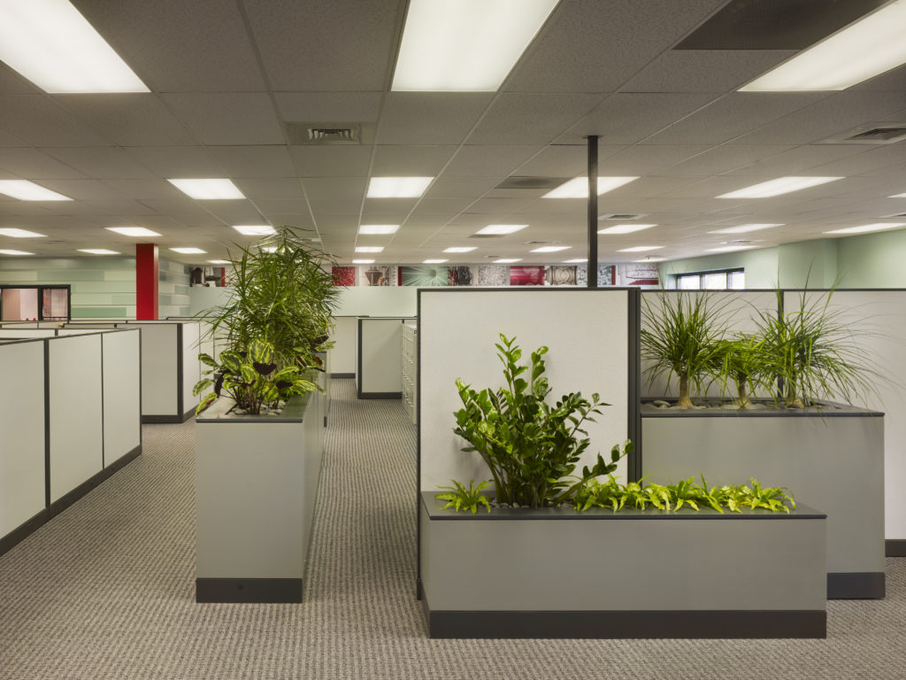
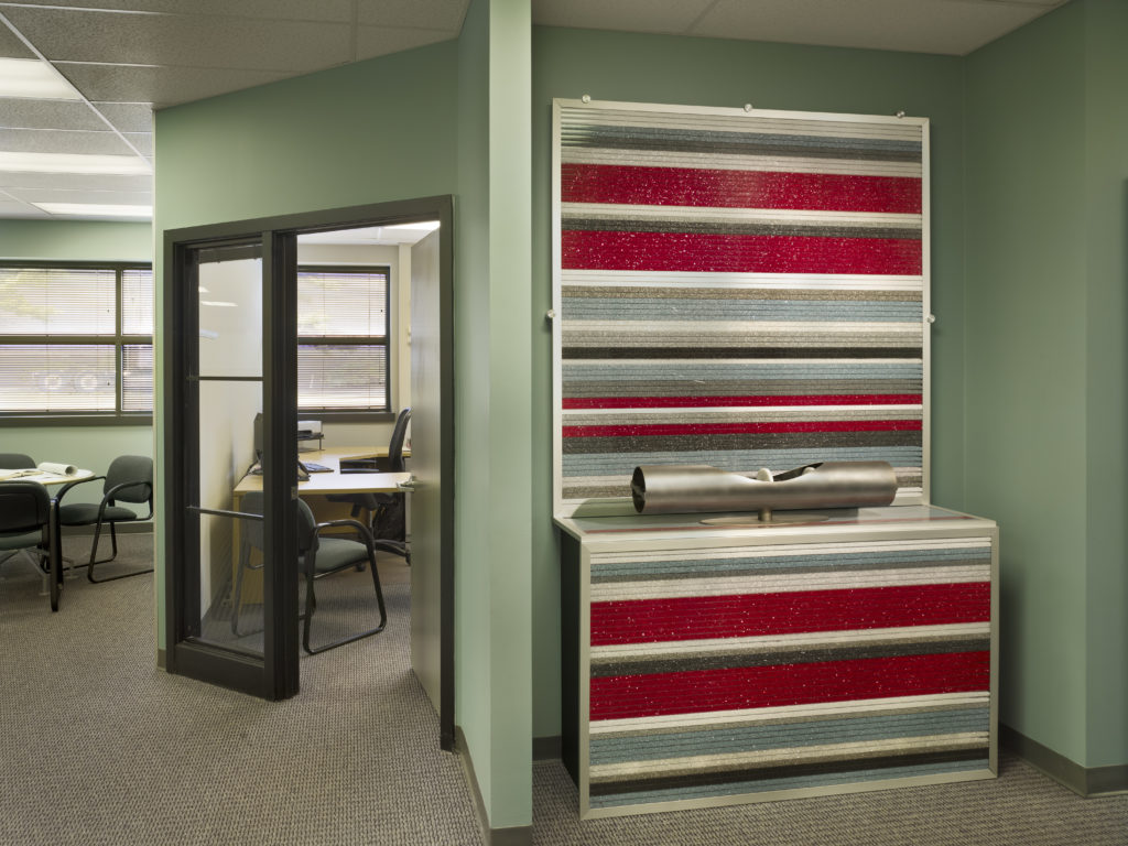
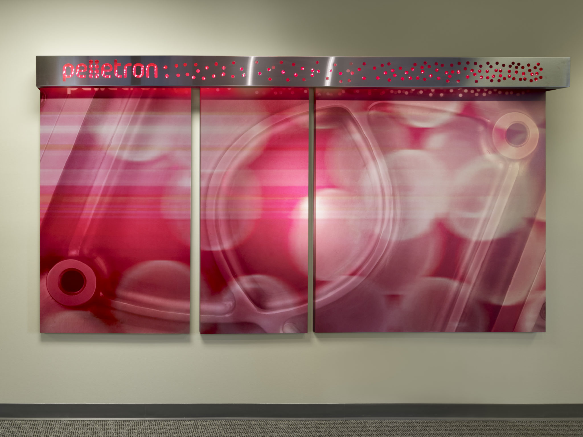
Artfully reflecting Pelletron’s brand and capabilities, Interiors by DECO finished the space with custom branded wall graphics, décor, and light fixtures. Two large art pieces were created from high resolution, abstract images of Pelletron’s manufactured parts and components. A band of similar imagery was applied to the walls in the open office area, while red, circular vinyl wall graphics inspired by the company logo were interspersed throughout. Wall art and a one-of-a-kind product display stand were constructed from greenhouse panels filled with the plastic pellets that the company’s equipment is designed to clean. A backlit aluminum light fixture was designed to showcase the company name, and all interior accents use Pelletron’s brand colors.
Pelletron Completed Space
The end result is an office that showcases the company’s products and services, while including immersive and memorable backdrops for employees and visitors alike to enjoy.
As businesses continue to find new ways to define and express their brands through experiential design, architects and interior designers will continue to play key roles in the execution of brand strategy.
Looking to create a branded space for your business? Contact us to get started.

